Русский
  English
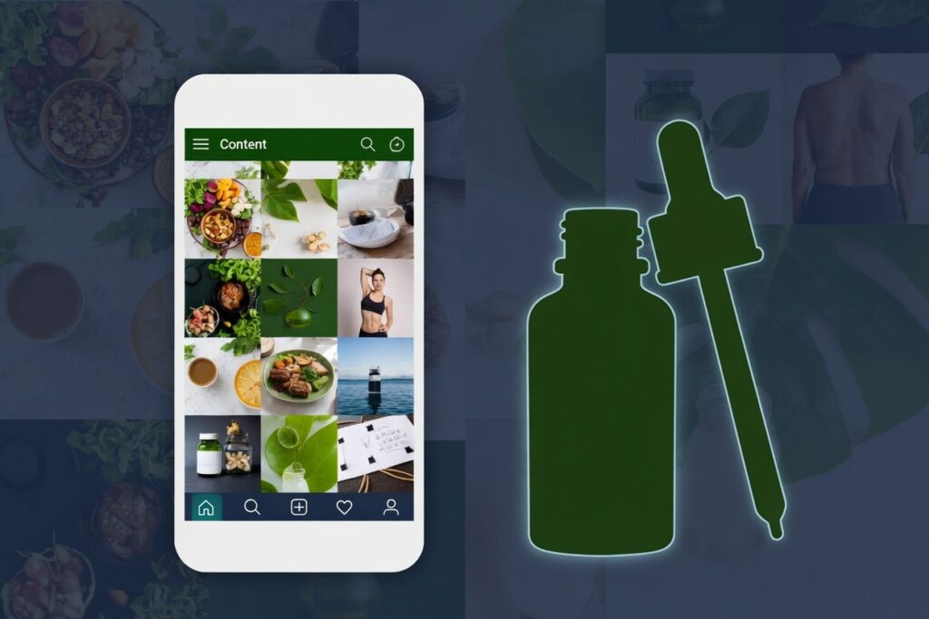
In nutra, the strongest offer rarely wins on its own. What usually wins is a setup where the creative hits a real pain point, the funnel does not contradict itself, and the white page looks like a normal website instead of a one-off placeholder. Approaches from gambling transfer poorly here: different pains, different creative burnout speed, and different expectations for prelanders and white pages.
Below is how working nutra setups are built today — from creatives and prelander types to the black page, source-specific white pages, and unit economics.
Creatives that work on Facebook, TikTok, and native
Traffic sources react differently to the same pain. That is why creatives are almost never made “universal for every channel.”
Facebook / Meta
Short everyday scenes work well. The viewer should recognize themselves in the first seconds: fatigue, swelling, weight plateaus, blood pressure, joints, “I already tried everything.” Then comes a hint at a solution and a soft call to action — without a hard “buy the course right now.”
UGC formats help a lot: shot as if on a phone, natural speech, no studio lighting and no announcer tone. Pain → before/after angles and dynamic creatives are still worth testing in batches. The faster a creative starts looking like a supplement ad, the shorter its life.
TikTok
Native matters even more here. The video should feel like regular feed content. Working patterns: a personal story, “I struggled for a long time → found an approach,” a quick path to the outcome without a long intro.
On-screen text and careful trend-style techniques can sometimes help retention, but showing the offer in the first seconds is usually a bad idea. TikTok punishes an “ad-like” tone and overly medical claims faster than many other sources.
Native (Taboola, Outbrain, and similar)
Creatives are closer to editorial material than to a performance banner. The headline and image promise a story or a breakdown: “why fatigue never goes away,” “what goes wrong with weight loss after 35,” “why swelling keeps coming back.”
Aggressive lines like “burned fat in 7 days” burn out faster on native and hit moderation more often. What wins here is the feeling of a useful article, not a direct sale.
The general rule is simple: in nutra, a believable scenario is usually stronger than the loudest offer. If it is obvious from the first frame that you are selling a supplement, part of the audience closes the ad immediately — and the whole setup gets more expensive.
Video creatives: hooks, pain, and structure
A strong nutra video almost always revolves around one pain, not around the product. The product appears later, once the viewer already has something to hold on to.
Hook (1–3 seconds). The job of the hook is to land on a recognizable situation. Not “we have the best formula,” but “woke up exhausted again,” “legs feel heavy by evening,” “the scale is not moving no matter what I try.” Without that, watch-through collapses and few people reach the offer.
Pain amplification. Next, show briefly how the problem interferes with daily life. Not a lecture and not a one-minute symptom list. Two or three concrete details the person has already said to themselves are enough.
Hint at a solution. This is still too early for a hard sell. Lines like “I found a simple approach,” “someone suggested a method,” or “it turned out the issue was not what I thought” work better.
Transition into the funnel. The ending is a calm handoff to the prelander or the next step. The more natural the transition, the smaller the gap between the expectation from the ad and what the user sees after the click.
Optimal length is most often 15–30 seconds. In practice it is easier to test in batches: one pain, several hooks, several visuals, the same type of warm-up.
Prelander, landing page, and black page: how the funnel is built
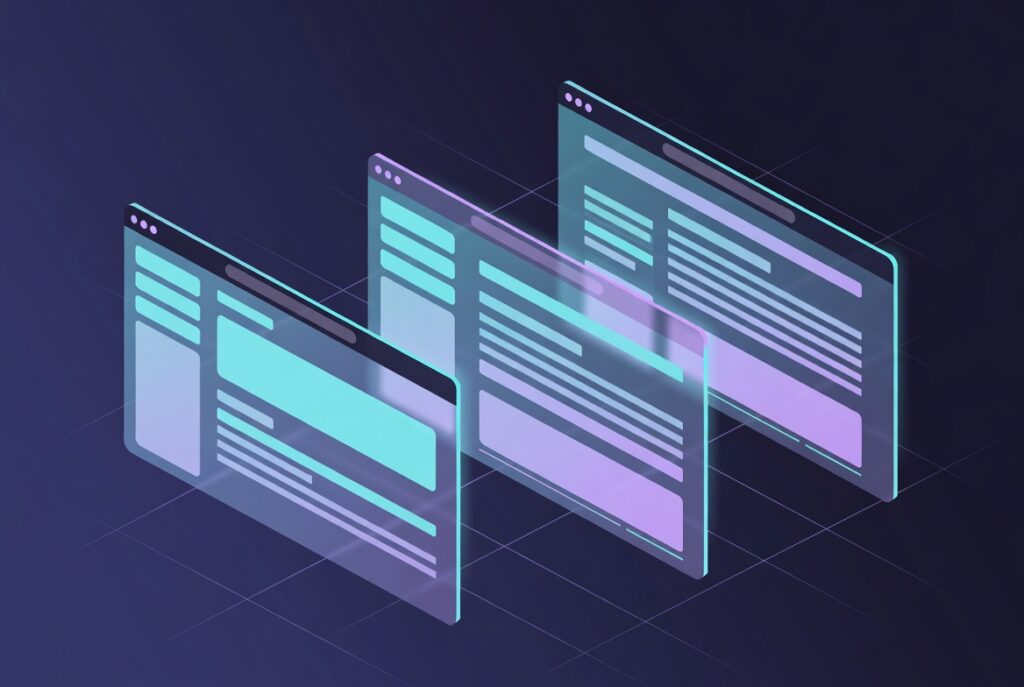
After the click, users rarely should be sent straight to a hard offer. In nutra the funnel usually has several layers, and each one has a role.
Black page — the money page: offer, price, order button, trust blocks, sometimes a timer. Real traffic sees it after cloaking. You can push benefit and urgency harder here, but without open overclaiming: exaggerated promises later hit approve rate and refunds.
Prelander — the warm-up step before the offer: story, short breakdown, quiz, personal experience. Usually no cart and no hard price.
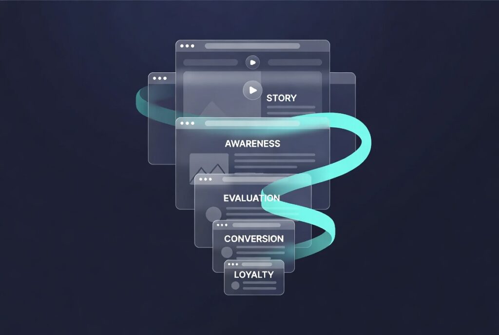
Prelander + black page setup:
- Creative
- Prelander
- Black page / offer landing
- Thank-you page and, if needed, an upsell
Going straight to the black page makes sense when the creative already warmed the audience well. Prelander + black page is the default for Facebook, TikTok, and especially native. Longer flows like “quiz → prelander → black page” are used when the pain is more complex or the average order value is higher.
It is critical that every screen speaks the same language. If the creative is a quiet personal story and the black page is a screaming landing with “100% guarantee,” both conversion and approve rate drop.
Core prelander approaches
1. Story / personal experience. Problem → what was tried → what helped → transition to the offer. Best with UGC on Facebook and TikTok.
2. Problem → cause → solution. First the pain, then a short clear “cause,” then a hint at a solution. Works well on native.
3. Review / comparison. “What I tried,” “what people choose,” “how this differs.” Useful when the niche is full of similar promises.
4. Quiz / survey. 3–5 short questions, then a “match” and handoff to the black page. Higher engagement, but an extra step.
5. News / editorial breakdown. Article style for native. Do not promise one thing in the headline and sell something else on the black page.
6. Mini-landing without price. Short warm-up: pain, 2–3 benefits, button forward.
How to choose:
FB/TikTok + UGC → story or mini-landing;
native → news-style, problem-cause-solution, review;
many objections / higher check → quiz or comparison;
very hard creative → short prelander or direct black page.
Unit economics: how to stay profitable

In nutra it is easy to generate a lot of cheap leads and still lose money — on approve rate, hold, and lead quality.
- CR to lead — if low, the problem is usually in the creative, prelander, or black page.
- Approve rate — share of confirmed leads.
- Cost per approved lead — calculate from approved leads, not raw ones.
- Test budget limit — how much you are ready to burn on a creative batch and one funnel.
- Hold and payouts — a high CPA with a long hold is often worse than a stable mid-range offer.
Logic: payout and average approve → maximum cost per approved lead → required CR and click cost. Cheap leads with low approve usually mean overclaiming in the funnel or the wrong audience. Normal approve with an expensive lead — weak creatives, costly clicks, or funnel leaks.
Which white page nutra needs

Google — informational or service site with structure.
Facebook — matches creative tone: blog or calm health/lifestyle.
TikTok — lighter and more native, without “clinical” overload.
Native — multi-page, media, blog, sections.
In a previous article we already covered which white page type fits which source in general. For nutra, page content should stay inside a useful or lifestyle frame, not a direct offer.
White page formats commonly used in nutra
Blog / media site — habits, nutrition, myth-busting.
Health site — general recommendations without hard treatment claims.
Review / personal experience — calm narrative without an aggressive offer on the first screen.
A pharmacy-catalog white page usually dies quickly.
Why template white pages burn faster in nutra
Typical patterns — “symptoms → miracle product → button,” stock visuals, copied copy, empty structure — get detected especially fast in nutra. The topic is sensitive, and there are more checks.
What usually kills a white page: one template across many setups, thin content, stock assets, and a mismatch with the creative. More alive white pages matched to the source and funnel tone win. You can order the best white page for your nutra setup from us.
Bottom line
A working nutra setup is a creative built around one pain, a prelander of the right type, a black page without overclaiming, a white page matched to the source, and clear economics based on approve rate. The teams that stay profitable count the cost of an approved lead — not just the number of cheap raw leads.
Related guides
Continue with these practical guides: the structure of an affiliate marketing landing page, White Page examples and templates and preparing a White Page for native ads.