Русский
  English

A landing page is a focused web page that a visitor reaches from an advertisement, search result, email, social post, or another traffic source. Its purpose is to explain one offer and guide the visitor toward a clear next step, such as requesting information, buying a product, registering for an event, downloading a resource, or opening a service.
Most landing pages use a single long page, but “single-page” does not mean “one screen.” A useful page answers a sequence of questions: Where am I? What is being offered? Why is it relevant? Can I trust the project? What happens when I click the button?

What is a landing page?
In simple terms, a landing page is a web page built around one audience, one offer, and one primary action. A conventional website usually introduces an organization, provides navigation, and supports several visitor journeys. A landing page keeps the reader focused on a specific decision.
For example, an online store may contain thousands of product pages, account features, delivery information, and category navigation. A campaign landing page can present one selected product, explain the terms, answer common questions, and lead directly to a purchase. A training company may have a website for all its programs, while a webinar landing page focuses on one topic, speaker, date, and registration.
Is every destination page a landing page? In analytics, almost any page where a session begins may be called a landing page. In marketing and web design, the term usually means a page intentionally created for a focused campaign or offer.
Can a landing page be part of a website? Yes. It may have its own domain, live inside a larger website, or serve as a campaign-specific service or product page. Its defining feature is the focused visitor journey, not its technical location.
What a landing page is used for
In digital marketing, a landing page connects the promise in a traffic source with the information needed for the next decision. If an ad promotes a consultation, the destination should explain that consultation, its terms, and how to request it. If a social post promotes an event, the page should continue that exact subject rather than sending the visitor to a generic homepage.
Focus attention. The page reduces unnecessary routes and presents information in the order a visitor needs it.
Explain the offer. It can describe the product or service, its practical benefits, process, conditions, limitations, and expected next step without making the user search through multiple sections of a site.
Generate a measurable action. The result may be an enquiry, purchase, registration, download, demo request, or move to another relevant page. This completed action is commonly called a conversion.
Test demand. A focused page can introduce a new offer before a full website is developed. Results still need careful interpretation: traffic quality, message clarity, page functionality, and the offer itself all affect performance.
Main types of landing pages
There is no single mandatory classification. It is more practical to group landing pages by the action and amount of information a visitor needs.
Service landing page. Explains a problem, the working process, deliverables, conditions, and a way to contact the provider. It is common for agencies, consultants, specialists, and local services.
Product landing page. Presents one product, plan, or digital offer. Specifications, use cases, limitations, price, delivery, and support information are usually important.
Event landing page. Provides the program, date, format, organizer information, and registration conditions. The main action is typically registration or ticket purchase.
Lead-generation page. Offers a consultation, calculation, demo, or resource in exchange for contact information. It should explain why the information is collected and what the person will receive next.
Click-through landing page. Prepares a visitor for another destination instead of collecting a lead. It explains the offer and sends the user to a catalog, application, checkout, or service.
Informational landing page. Answers a specific question in depth and then offers a relevant next step. A transparent White Page may use this format when it genuinely covers the advertised topic and presents the same content to visitors and review systems.
Essential landing page sections
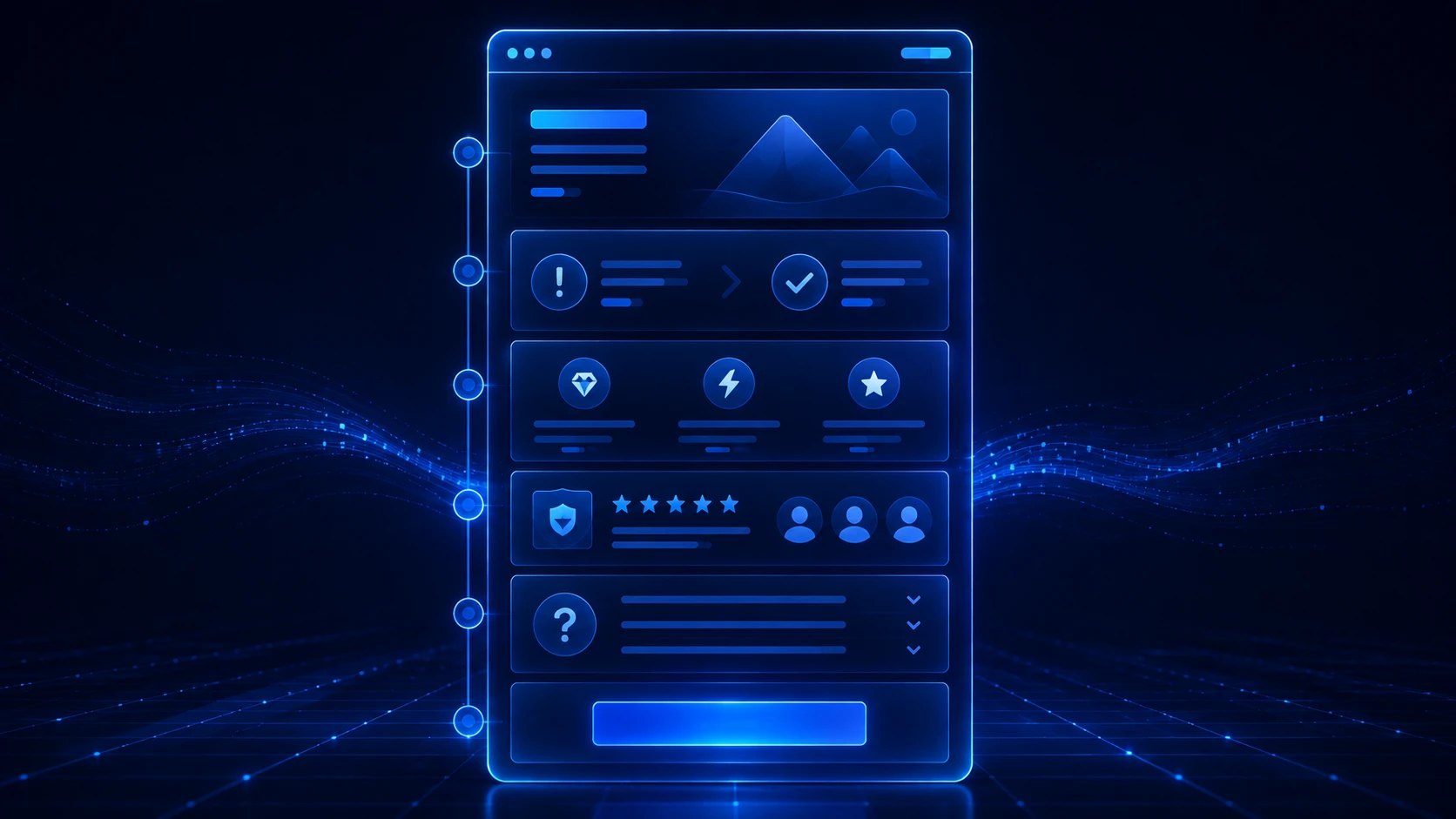
There is no universal block order, but effective landing page structure follows the reader’s questions. Every section should contribute information rather than exist only to make the page longer.
Opening section. A clear headline identifies the offer, supporting copy provides context, and the primary button names the next step. A visitor should quickly understand whether the page is relevant.
Problem and solution. The page describes the visitor’s situation and explains how the offer helps. Claims should be specific and supportable.
Benefits and details. This section covers the service scope, product specifications, workflow, timing, and limitations. Useful benefits connect features with practical outcomes instead of relying on generic claims.
Trust information. Real examples, authorship, company details, transparent terms, accurate guarantees, and accessible contact information reduce uncertainty.
Questions and objections. An FAQ can explain who the offer suits, what is included, how the next stage works, and which restrictions apply.
Primary action. A button or form should match its label. “View an example” should not unexpectedly open checkout, and a visitor submitting information should understand its purpose.
A basic landing page example, from the first screen to the next step
Imagine a local bicycle workshop creating a page for puncture repairs. This is a fictional teaching example, not an offer from WPGads. The page has one audience—people with a flat bicycle tyre—and one main action: ask the workshop whether it can take the repair.
Opening message: “Bicycle puncture repair: tell us what happened and check availability.” Supporting copy identifies the actual service area and explains that the workshop will confirm the repair scope and price before work starts. The first button says “Ask about a puncture repair,” not a vague “Continue.”
Service scope: the next block explains what the workshop checks and distinguishes a puncture repair from a tyre replacement or a full bicycle service. This gives the visitor enough context without promoting every service the business offers.
Process and conditions: “Describe the problem → confirm availability → agree the work and price → bring in the bicycle.” Add the real opening hours, accepted bicycle types, pricing basis, and any relevant restrictions. Do not promise same-day completion unless the business can actually provide it.
Trust and practical information: show genuine workshop photographs, its real name, location, and contact details. If customer reviews are available and permission allows their use, include them accurately; invented ratings are not a substitute for evidence.
Questions before the action: explain whether an appointment is needed, how the quote is confirmed, and what happens if the tyre needs replacing. These answers remove uncertainty about this particular service rather than filling space with generic FAQs.
Final action: repeat “Ask about a puncture repair” and open the stated contact channel. On a live page, verify that the button works and does not unexpectedly send the visitor to checkout. A contact button is enough if the workflow does not need a form.
This is a landing page because every block supports the same decision. The workshop’s main website might cover servicing, accessories, team information, and several locations; this page stays focused on one repair request. The example shows the page’s role and structure, not a guaranteed layout or conversion result.
Landing page vs website
The main difference is not simply the number of pages. It is the scope of the task and the number of visitor journeys the project needs to support.
| Criteria | Landing page | Multi-page website |
|---|---|---|
| Primary goal | One offer and one main action | Several topics, offers, and visitor routes |
| Structure | A sequence of sections on one page | Separate pages connected by navigation |
| Information depth | Enough detail for one decision | Broader information about the company, products, and services |
| Launch process | Usually faster to prepare and review | Requires a wider information architecture |
| Growth | Useful for testing a focused offer | Better suited to new sections and ongoing SEO content |
A landing page is not automatically the “simple” option, and a multi-page website is not automatically better. Choose the format that fits the information and journey. Our detailed comparison covers landing pages, multi-page websites, WordPress blogs, and stores.
How to decide whether a landing page fits
A landing page usually fits when the project has one main offer, a defined audience, and one clear next step. The information can be presented as a logical sequence without a large catalog or many independent sections.
- The visitor has one primary need that the page can address.
- The traffic source and destination describe the same offer.
- One coherent page can provide enough information for the decision.
- The primary action can be described in a short, clear phrase.
- Facts, terms, contact information, and links can be verified before launch.
Choose a multi-page website when the organization has several independent services, different audiences, a large catalog, extensive documentation, account features, or an ongoing SEO publishing plan. If you need to prepare different formats efficiently, review the AI website generator for landing pages, multi-page sites, and blogs.
Advertising campaigns also require close alignment between the traffic source and destination. Our guide to landing pages for affiliate marketing covers this campaign context in more detail.
Examples, common mistakes, and quick answers
Service example. The opening identifies the service and location. The following sections explain the relevant problems, process, team, conditions, and contact method without trying to promote many unrelated services at once.
Product example. The first section presents the product and primary benefit, followed by use cases, specifications, package contents, price, delivery, and common questions.
Event example. Visitors immediately see the topic and date, followed by the agenda, format, organizer, participation terms, and registration action.
Common mistake: starting with visual design. A polished interface cannot repair an unclear offer. Define the audience, goal, facts, and argument sequence before choosing decorative elements.
Common mistake: competing actions. Several equally prominent buttons with unrelated goals divide attention. Secondary routes can exist, but the primary action should remain obvious.
How many sections should a landing page have? As many as the visitor needs for an informed decision. A straightforward offer may need five to seven substantial sections, while a complex service requires more detail. Length alone does not determine quality.
Can a landing page rank in search? Yes, when it provides a complete answer to a focused query and is technically accessible to search engines. A multi-page website or blog is usually more practical for covering many topics and publishing regularly.
Can AI create a landing page? AI can help prepare structure, copy, visual direction, and code, but people still need to verify facts, positioning, mobile behavior, button actions, and the public version. See our workflow for creating a landing page with AI.
WPGads can generate a landing page foundation from a brief containing the niche, country, language, contact details, and keywords. Adapt the result to the real project and review every section before publication.