Русский
  English
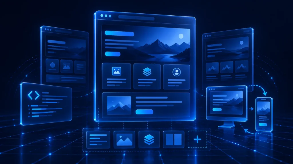
A landing page template can shorten the path from an idea to a working page. It may already include a grid, hero section, benefit blocks, a form or call-to-action button, and responsive styles. However, a finished template cannot simply be filled with random copy and treated as a completed landing page. It still needs to be simplified, rewritten, and tested against the product, traffic source, and audience expectations.
This guide explains the practical differences between HTML and Bootstrap templates, how to choose a suitable starting point, and how to adapt it without keeping unnecessary sections. If the format is new to you, begin with what a landing page is and how it works.
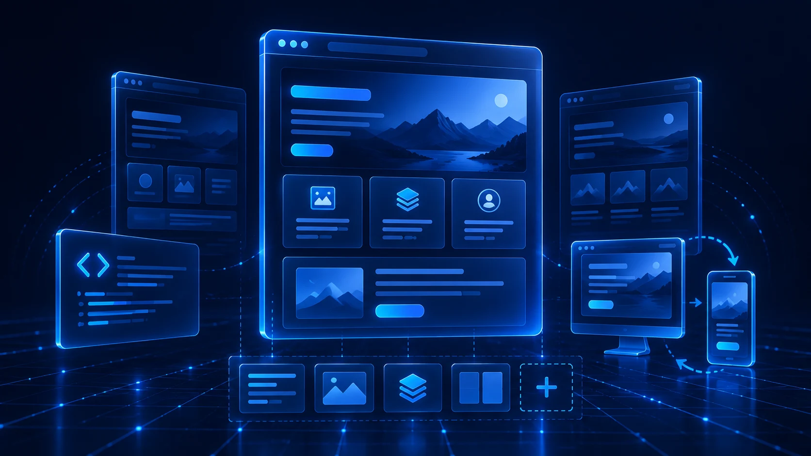
What a landing page template includes
A template is a prebuilt structure for a single-page website. It usually contains a layout grid, styles, common sections, and interface elements. Its purpose is to reduce design and development time, not to replace the work required to define the offer and write useful content.
HTML template. This is a set of markup, style, script, and image files. It gives you direct control over the code and can run without a content management system. Changes require at least basic HTML and CSS knowledge or help from a developer.
Bootstrap template. This type uses Bootstrap’s grid and components. Columns, buttons, navigation, and responsive behavior follow a shared system, making it easier to rearrange blocks while keeping a consistent layout. Unused components and styles should still be removed so they do not add unnecessary page weight.
Builder template. A visual builder is easier for people without coding skills. Its limitations depend on the platform: some pages cannot be exported, moved to another host, or optimized beyond the options provided. If you need control over the final files, check export conditions before choosing a builder.
None of these approaches is universally best. The right choice depends on the deadline, the team’s skills, the publishing workflow, and how often the page will change.
How to choose the right template
Start with the page goal rather than colors or animation. A focused offer may need only a clear hero, key benefits, supporting evidence, answers to objections, and one primary action. A product that requires comparison or explanation may need a longer structure.
Fit with the goal. The layout should lead toward one main action: submitting a request, registering, purchasing, downloading, or moving to the next step. If the template gives equal importance to a newsletter, catalog, blog, callback, and product page, you will need to restore the hierarchy.
Ease of editing. Check whether copy, images, colors, and section order can be changed quickly. A useful template is made of understandable modules and does not require half the project to be rewritten for one new block.
Mobile behavior. Open the demo at a narrow width. Buttons should remain easy to tap, text readable, and cards should stack without horizontal scrolling. A template can be technically responsive while still being uncomfortable to use.
Speed and cleanliness. Every extra library, effect, font, and background video adds weight. For most landing pages, restrained motion and one visual focus work better than a collection of decorative effects.
Technical readiness. Look for a logical heading structure, editable metadata, image alt fields, understandable file names, and a straightforward way to add analytics. A template should make launch easier instead of creating a technical cleanup project.
How to adapt a template to the offer
Begin with a short brief: who will arrive, which ad or source they come from, what problem they want to solve, and which action they should take. Then remove every section that does not help answer those questions. Adaptation usually begins by subtracting, not adding.
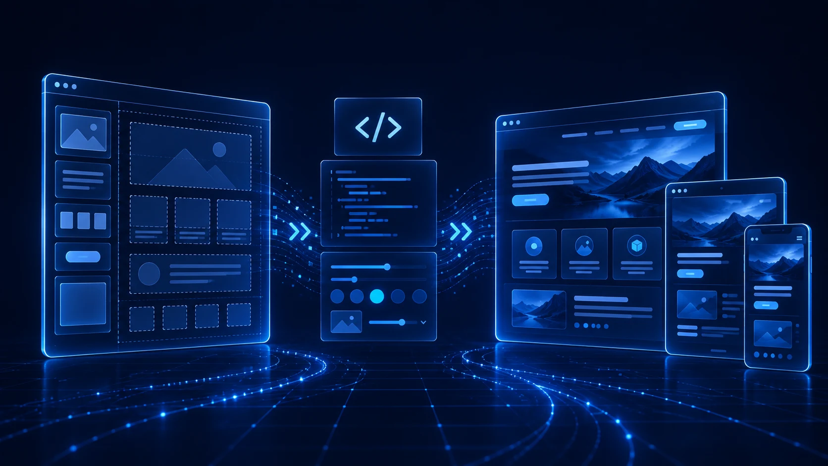
1. Rebuild the hero. A visitor should quickly understand what is offered, who it is for, and what happens after the button is clicked. The ad headline and page headline do not need to match word for word, but they should continue the same promise.
2. Replace demo content. Remove lorem ipsum, random icons, fictional testimonials, and numbers without a source. Use real product details and statements that can be verified. If evidence is not available yet, removing the section is better than manufacturing trust.
3. Create a clear sequence. Explain the benefit after the hero, add the details a visitor needs, and address the main objections. The primary button can be repeated after meaningful sections, but its label and result should remain consistent.
4. Define the visual system. Limit the color palette, use one primary button style, and establish consistent spacing. Heading and body sizes should create an obvious hierarchy, while images should help explain the product instead of filling empty space.
5. Test responsive behavior. Check a real phone, long headlines, button wrapping, tables, forms, and image crops. Interactive elements should not sit too close together.
6. Prepare for publishing. Compress images, remove unused files, write the Meta Title and Description, add alt text, and test every internal path. If you want a faster route from a brief to a usable starting point, see how an AI landing page generator can help.
A complete adaptation example
Imagine adapting a generic Bootstrap template for a local mobile bicycle puncture repair service. The demo includes a large navigation menu, a twelve-item portfolio, a team section, pricing tables, a newsletter form, and several animations. Most of those elements are irrelevant to the visitor’s immediate need.
The revised hero contains the service, the area covered, a short explanation of the outcome, and a contact button. The next section shows three steps: request, address confirmation, and repair. The page then explains what the standard service includes, which cases require a separate estimate, and when call-outs are available. Real equipment photos and a concise payment FAQ support the offer before the primary button appears again.
The menu, newsletter, decorative counter, and unverified testimonials are removed. A heavy background video is replaced with an optimized image. On mobile, the phone number and action remain visible without covering the content. The template keeps its useful grid and base styles, but the page now matches the visitor’s intent.
Common mistakes and a pre-launch check
Keeping every demo block. A demo page is designed to show the template’s capabilities, so it almost always contains more sections than a real landing page needs.
Competing actions. Buttons with different promises force the visitor to choose a route. Define the primary action and make the rest of the page support it.
Generic copy. Claims such as “high quality” do not explain the value. Replace them with concrete conditions, process details, and outcomes.
Desktop-only testing. Many issues appear only on a narrow screen: small text, clipped cards, awkward buttons, and oversized images.
A mismatch with the ad. The landing page should continue the creative’s promise. For paid traffic, the visitor should not arrive at a page with a different product, tone, or action. Our guide to landing pages for affiliate marketing explains this connection in more detail.
Before launch, confirm that the page has one understandable offer, one main action, a usable mobile version, acceptable loading speed, working buttons, no demo data, complete metadata, and a logical heading structure. Open the final public URL after publishing and repeat the check.
Final takeaway
An HTML or Bootstrap landing page template saves time on base development, but adaptation determines the quality of the result. Remove unnecessary sections, align the hero with the traffic source, replace demonstration content, test the mobile experience, and prepare the page for publishing. The template then becomes a useful foundation rather than merely an attractive mockup.
WPGads can help you prepare the structure and content for a new page, download the result, and refine it for a specific campaign. Product updates and practical guides are published in the WPGads Telegram channel.